AIR NEW ZEALAND
DELIVERABLES
User Research
Business Analysis
Paper Sketches
Usability Testing
Wireframes
Prototypes (Lo/Hi-Fi)
TOOLS
Sketch
Invision
Omnigraffle
Pen and Paper
TEAM
2 Designers
MY ROLE
UX/UI Designer
UX Researcher
PLATFORM
Mobile / iOS
CHALLENGE
Create a unique mobile experience by including all of the in-flight entertainment system and service features from the seat-back application to the existing Air NZ mobile app.
Consider new features that will align with business goals and appeal to current and new users.
COMPANY
Air New Zealand is an innovative leader in airline service and technology. The redesign of their inflight entertainment system has won several industry innovation awards.
Every customer matters —
whether you are flying economy or business premier,
Air New Zealand seeks to provide a world-class, personalized customer experience throughout all platforms.
SOLUTION
Redesign the existing mobile app with additional features that will enhance the airline travel experience and increase user engagement.
Aim to keep existing Airpoints™ members loyal to Air New Zealand and also attract new people to join Airpoints™,
Air NZ’s free loyalty mileage program by making these features exclusive to members.

01
DISCOVER
The current mobile app provides the essentials
— real time flight info, book/change a flight,
online check-in, and Airpoints™ account info.


CONCEPT PROJECT
NEXT
LACQUER
COMING SOON


 |  |  |  |  |
|---|

USER FLOW 1
24 hours before your flight, you can browse the library of entertainment content available on your flight and be able to save content to favorites.
 |  |  |  |  |
|---|

 |  |  |  |  |
|---|---|---|---|---|
 |  |  |  |  |
 |  |


02
IDEATE & DESIGN
PERSONAS
We created two personas that we felt reflects Air NZ’s customer base. However, for this project, we decided to focus on one persona, Maia.
+ Maia is an Airpoints™ member and mother who travels with her family.
+ Wants to easily watch a movie with her husband before and during the flight while her kids are entertained.
+ Needs to easily request for items from a flight attendant because her kids are quite messy.
DESIGN PROCESS

SOLO ITERATIONS
After our group project was over, I went back and redesigned two versions of the home screen.
I A/B tested the two screens with users and chose the screen on the far right as my final design.


TEAM ITERATIONS
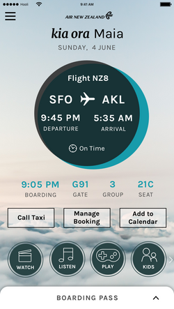
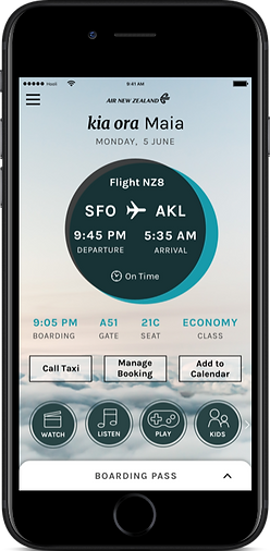
These are the changes we made for the home screen for when the user in checked in but has not boarded the flight.
We initially had a CTA button to view the boarding pass but thought it would be easier for the user if we kept the boarding pass on the bottom as a slide-up screen.
The screen to the right was our final design.
USER FLOW 1
EXISTING APPS
INFLIGHT SEAT-BACK APP
MOBILE APP
STYLE/BRAND GUIDE
I was able to find Air New Zealand’s style/brand guide online from their latest re-branding and shared it with my teammate. We used this resource to guide our design choices.


COMPETITIVE
RESEARCH
There are only a few airlines that service flights to New Zealand.
Through research we were able to notice the similarities and differences between Air New Zealand and its competitors' mobile apps.
+ Virgin America’s mobile app has a modern and inviting design, but only offers standard features like check-in and boarding pass info.
+ United has a mobile app with the same standard features. They used to provide free inflight entertainment, but now it is only available through purchase.
+ Qantas has two separate mobile apps. One is for general booking and boarding information and the other is for their entertainment offerings.
FEATURES
We brainstormed and created new features that we felt aligned with both the user goals from our persona and business goals of Air NZ as well.
These new features will be available exclusively to Air NZ Airpoints™ members who use the mobile app.
The redesigned mobile app will be launched along with the introduction of wifi services on the airline's international flights.
Wifi will be free for the use of this app, but will also be available for purchase.
FEATURES
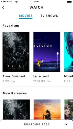
+ 24 hours before your flight, you can browse the library of entertainment content available on your flight and be able to save content to favorites
+ 2 hours before your flight, you can browse the library of content and also be able to enjoy the content (watch movies, listen to music, play games, etc)
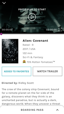
+ Playback feature for movies/shows/video content will save your position when you pause so you can resume watching from that position at any time
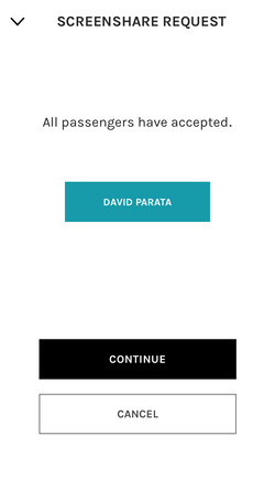
+ Enjoy both screen share and seat-to-seat chat features at the same time
USER JOURNEY
& USER FLOW
We focused on creating a user journey for our persona which helped us to organize 3 different user flows.
Maia’s User Journey = 3 User Flows
01) 24 hours before departure.
Maia is at home browsing movies on the app and adds the movie “Alien” to her favorites.
02) 2 hours before boarding, waiting at the gate.
Maia finds the movie “Alien” from her favorites and begins watching the movie on her mobile device with her husband.
03) On the plane.
Maia resumes watching Alien with her husband while screen sharing and chatting with him.
Her son makes a mess so Maia requests for napkins from the flight attendant.
DESIGN
We roughly sketched out on paper our necessary screens in order to clearly articulate our ideas and concepts.
We also facilitated a quick Design Studio workshop which was extremely useful for creating rapid ideas and designs.
We discovered that we needed to make two separate home screens for our app that will change based on whether the user's ticket has been scanned or not.

03
TEST & ITERATE
USABILITY TESTING
Once a paper prototype was created, we sat down with 5 users and gave them tasks to complete based on our 3 user flows.
ITERATIONS
Feedback from usability testing was crucial in guiding our next design decisions.
We noticed that some users struggled with a part of the third user flow that involved screen sharing with another user.
04
DELIVER
WIREFRAMES
Once the designs and flows were finalized, we created wireframes for all 3 user flows with annotations.
 |  |  |
|---|


SOLO ITERATIONS
I revisited the boarding pass screens on my own and A/B tested my two designs with users.
The screen on the far right felt more like the Air NZ brand and was chosen as the final design.


TEAM ITERATIONS
Since we chose to make the boarding pass viewable as a slide-up screen, we made changes to our initial design to reflect this decision.
USER FLOW 2
SOLO ITERATION
Someone brought up an interesting question...
"What would the screen would look like if there are two minimized screens since the boarding pass is constantly fixed to the bottom?"
After sketching out multiple possible solutions, this was my final design.


SOLO ITERATIONS
I redesigned two versions of this home screen and also tested with users to get feedback.
The screen on the far right is my final design, however I feel like it can still be taken further to reflect more of the Air NZ brand and style.


TEAM ITERATIONS
These are the changes we made to our second home screen that the user sees when s/he is boarded on the plane.
To keep the interactions consistent to the changes that we made to our boarding pass screen, we decided to remove the "resume watching" button and replace it with a similar slide-up screen.
USER FLOW 3


TEAM ITERATIONS
One of the ideas we had prior to the slide-up/down screen was to minimize the screen into a small box on the bottom right of the home screen.
This way the user can interact with the rest of the app while still watching the content (similar to Youtube).
We realized that this idea would not work for our app because it covers up the buttons on the home screen that the users need to read and click on.
We also scrapped the idea of having round buttons for our Crew button menu pop-up.


TEAM ITERATIONS
These were our initial wireframes for the screen sharing flow.
We noticed that users were confused since we didn't include a way for them to know if their screen sharing invitation was accepted or not.
We focused on making this flow clearer and easier to understand for the user.
You can see our final iteration below in the Deliver section of this page.
FINAL SCREENS
You can view the final screens for this app below.
They are separated and organized into our 3 user flows.
An InVision prototype was made for our third user flow which you can interact with here.
USER FLOW 2
2 hours before your flight, you can browse the library of content and also be able to enjoy the content (watch movies, listen to music, play games, etc).
USER FLOW 3
Playback feature for movies/shows/video content will save your position when you pause so you can resume watching from that position at any time. Enjoy both screen share and seat to seat chat features at the same time.