ONE DAY MAGAZINE
DELIVERABLES
User Research
Business Analysis
Paper Sketches
Usability Testing
Wireframes
Prototypes (Lo/Hi-Fi)
TOOLS
Sketch
Flinto
Pen and Paper
TEAM
2 Designers
MY ROLE
UX/UI Designer
UX Researcher
PLATFORM
Web
CHALLENGE
Redesign One Day’s website to have it be a stand-alone online magazine experience that will invite users to interact and share articles with their network.
Provide content in an easily digestible way that will aim to strengthen the TFA alumni community and inspire them to do great things and make a collective impact in society.
CLIENT
One Day is the alumni magazine of Teach For America. They publish reporting and commentary on critical issues in pre-K–12 education and on the evolving work of Teach For America’s alumni and corps members.
Their mission is to provide the information, perspective, and inspiration that their readers need to actively engage in the movement for educational equity and excellence.
SOLUTION
Restructure the website’s information architecture with clear and easy navigation to encourage browsing and reduce drop-off.
Design intuitive and engaging section pages, article layouts, and homepage with added interactive multimedia elements.

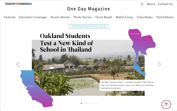
HOMEPAGE
With discoverability in mind, we decided to bring out the hidden sections from the hamburger menu into a global navigation bar.
We chose a bold, eye-catching design for the carousel of feature articles from the latest edition.
Other articles from the latest edition that are not features are displayed in a collage-style list, with colored tags indicating their category type.
A video strip highlights the latest video content with a short preview clip and description.
Match.Corps and Class Notes are two categories unique to One Day Magazine that are popular with Teach for America alumni.


CURRENT SITE


CURRENT SITE
INTERACTIVE MULTIMEDIA
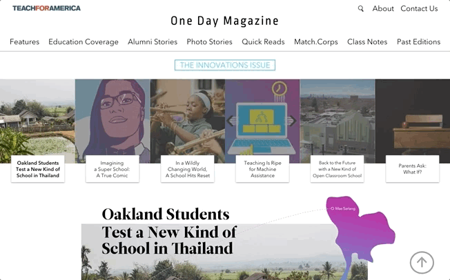
Feature articles that are from the same package/edition are clearly grouped together in a banner on top of the article. The placement and visual layout encourages users to explore these articles.
Parallax scrolling and collage-style layouts offer the user a unique way to view One Day's high quality photographs.
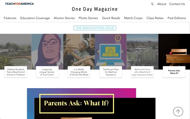
Hovering over highlighted text reveals bonus content such as author's notes or infographics. This interaction adds an element of discoverability and delight.
Clickable inline audio clips immerses the user and enhances the reading experience.
ARTICLE ANCHORS
For lengthy feature articles that have multiple sections, adding a sticky, anchor navigation bar saves the user time by reducing the need to scroll through the article.
Clicking on a section title will automatically scroll the user to the respective place on the page.


CURRENT SITE


CURRENT SITE
END OF THE ARTICLE
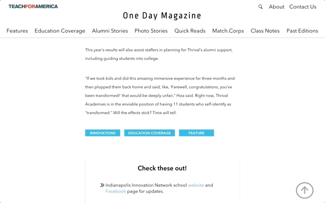
We added a reaction poll at the end of each article, which provides the user a quick and easy way to express their immediate feelings.
The poll also acts as a useful tool to collect data that will help influence the direction of future content from the magazine.
Social sharing buttons at the bottom of the article encourages users to share articles and engage with their community.
Clicking the Contact Us button pops open a contact form modal, so users can send a message and resume browsing from their current spot.
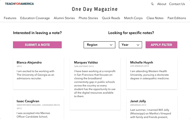
CLASS NOTES
Questions above each CTA button act as a friendly guide for the user.
We chose to add a reaction poll to each note so users can interact with their alumni community in a delightful way.
Reaction polls are only visible on a hovered note to reduce visual clutter and discourage competition.


CURRENT SITE

USER RESEARCH
Based on the data gathered from 6 phone interviews and 26 online survey responses, we were able to notice patterns in user behavior and develop 3 personas.
Each persona was created with it's own user flow in mind.

By researching popular and well established online publications, we were able to notice unique characteristics related to discoverability, page layouts, and multimedia elements.
We took note of moments of delight as well as certain pain points while browsing these sites and used this information to guide our design ideas.
COMPETITIVE RESEARCH


CURRENT SITE
OUR VERSION
PROBLEMS
The copy for sections 'Photo' and 'Notes' were too vague.
Users interested in reading Match.Corps stories had a hard time finding the articles since they are hidden under the Alumni Stories section.
Users weren't sure which articles were categorized under 'Education Coverage' or 'Alumni Stories'.
There’s no indicator or clear distinction between feature articles and quick reads unless the user checks the length of an article.
SOLUTION
Moved 'Match.Corps' articles out of the 'Alumni Stories' section and into it's own category section for easier discoverability.
Grouped the shorter, lighter articles into a 'Quick Reads' category section in the nav bar for casual readers.
Changed the copy of the 'Photo' and 'Notes' sections to 'Photo Stories' and 'Class Notes' so users can get a better understanding of what these sections contain.
Our toughest task was to analyze and reorganize the website’s information architecture.
The wording of sections and the article categorization were the two main pain points we discovered.
INFORMATION ARCHITECTURE


Our next step involved a lot of white-boarding and paper sketching to visually articulate our ideas and concepts.
DESIGN
USABILITY TESTING
Once a paper prototype was created, we sat down with five users and gave them tasks to complete based on our three user flows.
The same user flows were tested on both the current website and our paper prototype. The users’ behavior, reactions, and comments were video recorded and documented in notes.
We spent on average 40 minutes testing with each user.
A lot of questions were asked from both sides, which resulted in a great amount of insight and bonding over mandatory snack breaks.

ITERATION 02
We also noticed that users were uncertain if the 'Innovations Issue' text on our feature articles banner was clickable or not since it was overlapping the article images.
To reduce confusion for the user, we changed the 'Innovations Issue' link into a clear button above the features banner.

ITERATION 01
We noticed that the main confusion for users during testing came from their interactions with our reaction poll buttons.
Initially we thought the confusion came from our poorly drawn emojis, but further testing revealed that we needed to add text to describe what each reaction meant.
We also scrapped our emoji icons and created flat icons that harmonized with the rest of our site designs.


Once the designs and flows were finalized, we created wireframes with detailed annotations.
WIREFRAMES
We believed that making a Flinto prototype was the best way to bring our interactions and animations to life!
PROTOTYPE
Click here to download and view our annotated design decisions.
DESIGN
DECISIONS

PERSONA #1
TFA Social Butterfly
This user is well connected to other TFA alumni and has many friends from TFA who they keep in close contact with.
Since this user has many TFA alumni friends, s/he is always being sent articles or sees articles being shared on social media.
This user will land on the website through a deep link and will typically read 2-3 articles in one session.
This user likes to share articles and wants a way to react to articles as well.

PERSONA #2
Average TFA Alumni
This user doesn't keep in touch with other TFA alumni but is still curious to know what they are up to.
Since this user doesn't have a large network of TFA alumni friends, s/he rarely sees or gets sent article links to the magazine site.
This user will start browsing from the homepage and is interested in seeing content about alumni who are from a specific corps region.

PERSONA #3
One Day Magazine Print Reader
This user receives the print version of the magazine and reads articles from there.
Typically the user will start reading an article from print but will try to finish reading the article online for convenience.
This user wants to share articles with friends but doesn't have a good way to do so through the print version.
Throughout our process we were mindful of how our designs would look as a responsive site and used this to guide our design choices.
I am looking forward to revisiting this project and designing its responsive layouts.